
The Pokémon TCG’s Delta Species cards are some of the most unusual and memorable cards from the EX era.
First introduced during the EX Series, Delta Species Pokémon are special variations of familiar Pokémon that have a different type than their normal Pokémon counterparts. This unique concept resulted in cards featuring Pokémon with unexpected typings, including Metal, Dark, Fire, Water, and other types.
But the Delta Species era wasn’t just interesting for its unusual typing. The artwork was also unlike anything else in the Pokémon TCG at the time.
Many of these cards placed Pokémon in unusual environments and situations, while artists experimented with darker color palettes, unique compositions, and creative interpretations of familiar Pokémon.
Delta Species cards appeared across several sets and products, including:
- EX Delta Species
- EX Legend Maker
- EX Holon Phantoms
- EX Crystal Guardians
- EX Dragon Frontiers
- POP Series 4
- POP Series 5
- Nintendo Promos
With so many unique cards to choose from, narrowing the list down to just ten wasn’t easy.
These are my picks for 10 underrated Delta Species Pokémon card artworks. This isn’t a list based on card value or rarity. Instead, I’m focusing on artwork that I think deserves more attention from collectors.
Important Note About Card Finishes/Printing: Some Pokémon cards from the Delta Species era were printed in multiple finishes, including holofoil, reverse holofoil, and non-holo versions. Availability varies depending on the specific card and set. The card images featured in this article represent the specific versions being discussed, so be sure to check the card’s finish when comparing prices or purchasing a copy.
#10 – Smeargle
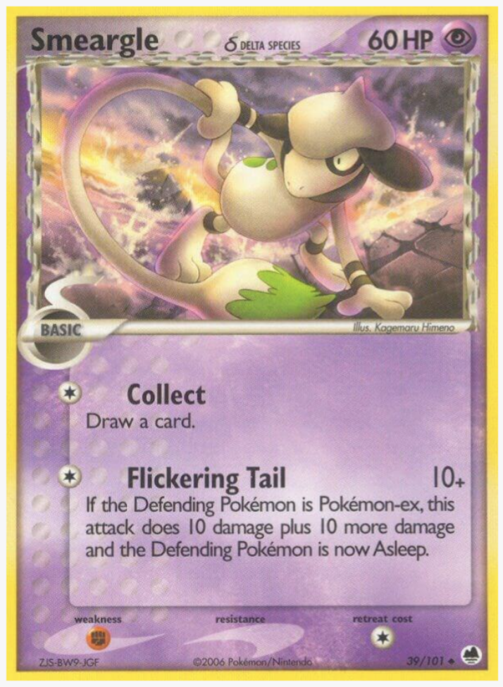
Card Details:
Set: EX Dragon Frontiers
Card: 39/101
Rarity: Uncommon
Type: Psychic
Illustrator: Kagemaru Himeno
Printing: Normal, Reverse Holofoil
Smeargle isn’t usually the first Pokémon that comes to mind when you think of intimidating Pokémon artwork.
That’s part of what makes this card so fun.
Instead of portraying Smeargle as timid or harmless, this artwork gives it a much more assertive presence. The pose and expression make Smeargle seem ready to put its abilities to use.
I also like how different this interpretation feels from the way Smeargle is normally portrayed.
Why it’s underrated: It’s an unexpectedly tough-looking take on a Pokémon that usually gets a much more playful treatment.
#9 – Fearow
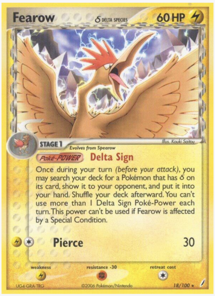
Card Details:
Set: EX Crystal Guardians
Card: 18/100
Rarity: Rare
Type: Lightning
Illustrator: Kouki Saitou
Printing: Normal, Reverse Holofoil
This Fearow artwork immediately caught my attention because of how powerful the Pokémon looks.
Fearow is already a fairly intimidating Pokémon, but the composition here makes it look like it’s preparing to strike.
There’s something about the pose and surrounding environment that reminds me of some of the more dramatic legendary Pokémon artwork, particularly Zapdos and Ho-Oh.
It gives Fearow a much greater sense of importance than you might expect from a relatively ordinary Pokémon.
Why it’s underrated: The artwork makes Fearow feel like a much more imposing Pokémon than it typically does.
#8 – Chikorita
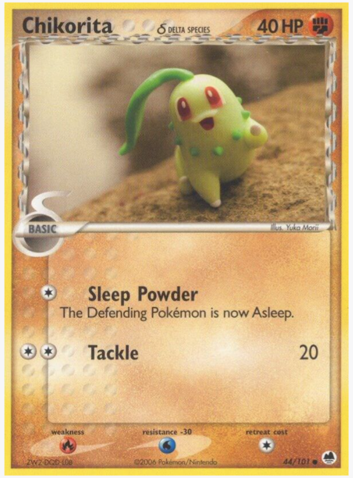
Card Details:
Set: EX Dragon Frontiers
Card: 44/101
Rarity: Common
Type: Fighting
Illustrator: Yuka Morii
Printing: Normal, Reverse Holofoil
This might be one of the cutest cards on the entire list.
The Chikorita artwork from EX Dragon Frontiers was illustrated by Yuka Morii, whose distinctive clay-style artwork has become one of the most recognizable styles in the Pokémon TCG.
There’s something incredibly charming about this particular Chikorita. The pose, expression, and overall composition make the Pokémon feel almost like a little clay figure that you could reach into the card and pick up.
It’s the kind of card that doesn’t need to be flashy to stand out.
Why it’s underrated: The combination of Yuka Morii’s unique style and Chikorita’s adorable expression makes this one of the most charming Delta Species cards.
#7 – Bagon
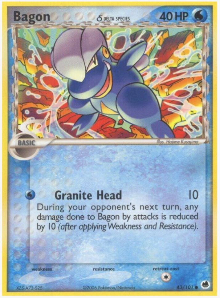
Card Details:
Set: EX Dragon Frontiers
Card: 43/101
Rarity: Common
Type: Water
Illustrator: Hajime Kusajima
Printing: Normal, Reverse Holofoil
Bagon has one of those Pokémon designs that can be surprisingly difficult to make look interesting.
This card gets it right.
The artwork gives Bagon a little bit of attitude, with an expression that almost looks like it’s smirking at the viewer.
I also really like the color coordination between Bagon and the surrounding artwork. The blue tones complement the Pokémon rather than simply putting it against a generic background.
It’s a relatively simple card, but that’s part of its appeal.
Why it’s underrated: The combination of Bagon’s expression, color palette, and setting gives this otherwise simple Pokémon a surprising amount of personality.
#6 – Ludicolo
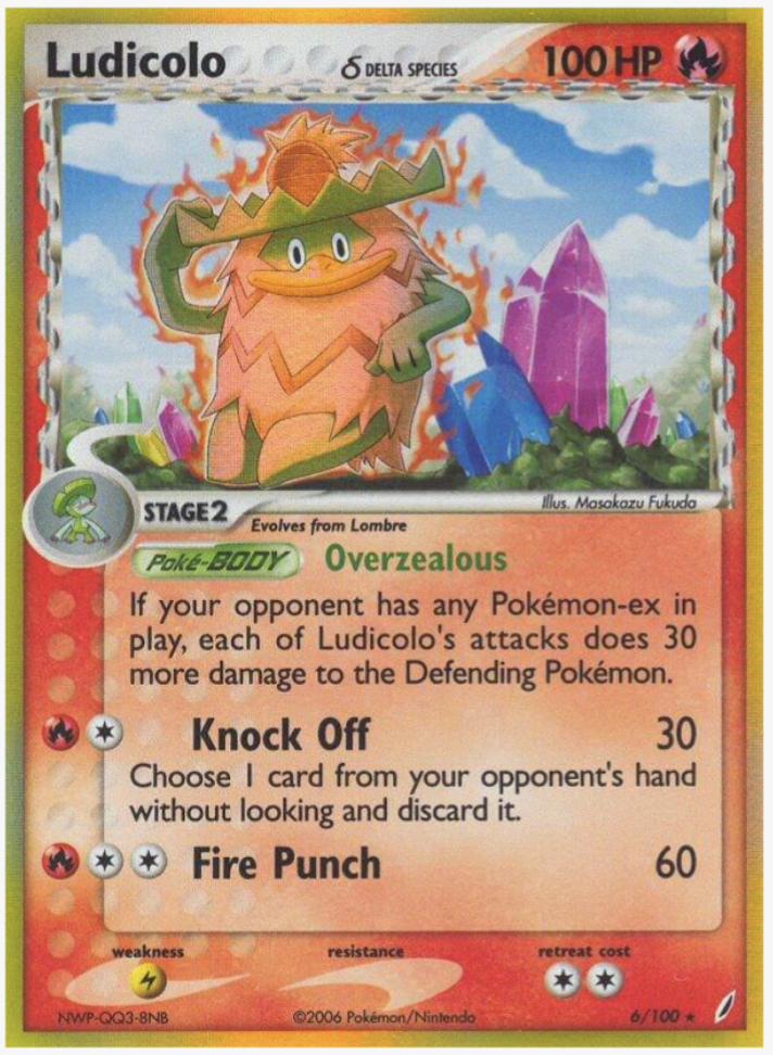
Card Details:
Set: EX Crystal Guardians
Card: 6/100
Rarity: Rare Holo
Type: Fire
Illustrator: Masakazu Fukuda
Printing: Normal, Reverse Holofoil
Ludicolo is already one of the more entertaining Pokémon designs, and this artwork leans into that personality.
There’s something hilarious about seeing Ludicolo surrounded by what appears to be an intense situation while maintaining its carefree attitude.
It somehow manages to look both completely unbothered and completely in its element.
That’s what I love about good Ludicolo artwork: the Pokémon can be surrounded by chaos and still look like it’s having the time of its life.
Why it’s underrated: The artwork captures Ludicolo’s personality perfectly while giving it a surprisingly dramatic setting.
#5 – Marowak
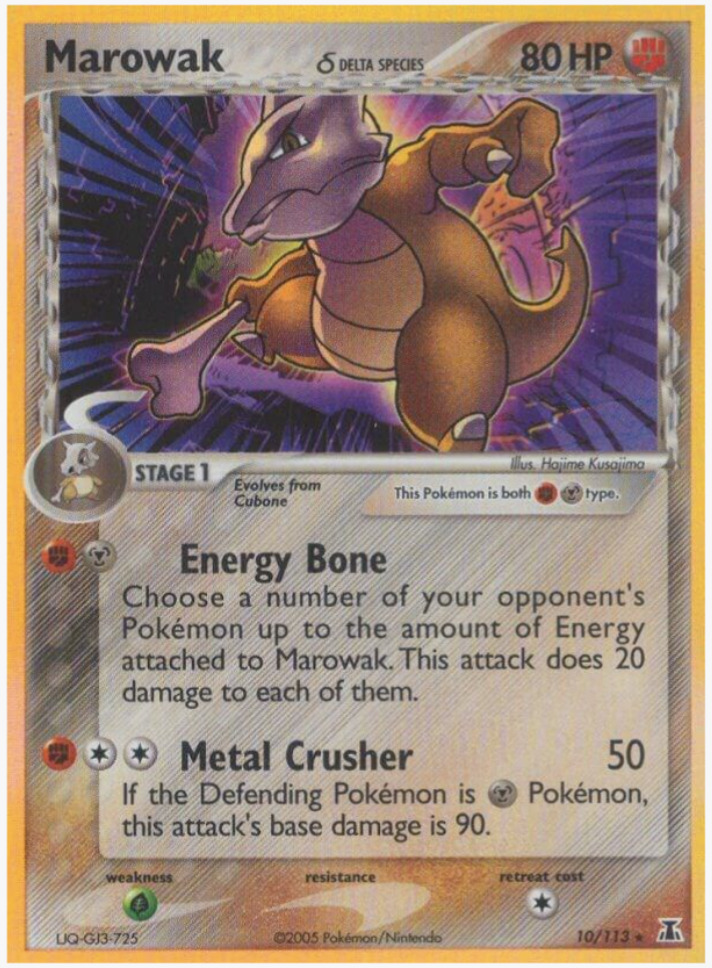
Card Details:
Set: EX Delta Species
Card: 10/113
Rarity: Rare Holo
Type: Fighting/Metal
Illustrator: Hajime Kusajima
Printing: Normal, Reverse Holofoil
Marowak can be portrayed in many different ways, but this Delta Species artwork takes a particularly dark approach.
The overall composition gives Marowak a much more imposing presence. Rather than feeling like a Pokémon simply standing around, it looks like it’s ready to attack.
The darker atmosphere works especially well with Marowak’s design and signature bone weapon.
This is one of those cards where the artwork makes the Pokémon feel more dangerous than you might expect.
Why it’s underrated: The darker atmosphere and imposing pose give Marowak a serious presence that isn’t always captured in its other card artwork.
#4 – Heracross
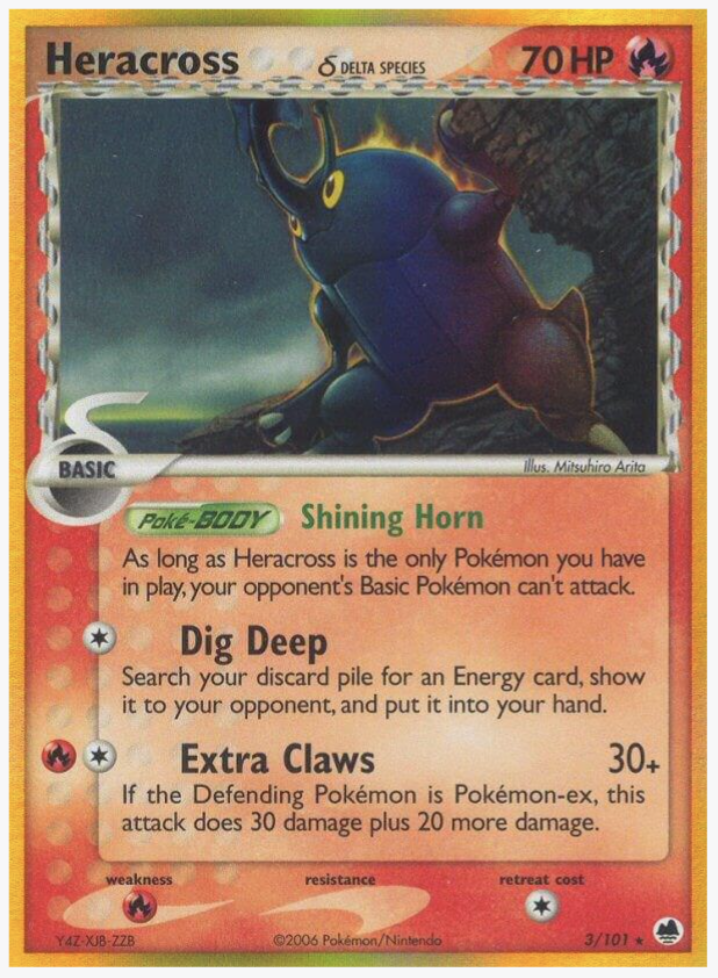
Card Details:
Set: EX Dragon Frontiers
Card: 3/101
Rarity: Rare Holo
Type: Fire
Illustrator: Mitsuhiro Arita
Printing: Normal, Reverse Holofoil
A flaming Heracross is already a pretty great concept.
This artwork takes advantage of that idea and makes the Pokémon look genuinely intimidating.
Heracross has always been one of the more physically imposing Bug-type Pokémon, and the fiery setting gives it an almost ominous quality.
It’s a great example of what made the Delta Species era so interesting: taking a familiar Pokémon and putting it into an environment you wouldn’t normally associate with it.
Why it’s underrated: The fiery setting completely changes the feeling of Heracross and gives the artwork a surprisingly hardcore aesthetic.
#3 – Pinsir
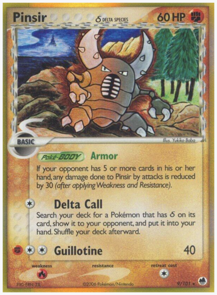
Card Details:
Set: EX Dragon Frontiers
Card: 9/101
Rarity: Rare
Type: Fighting
Illustrator: Yukiko Baba
Printing: Reverse Holofoil, Holofoil
Pinsir has always had an intimidating design, but this artwork takes that intimidation to another level.
What stands out to me most is the landscape surrounding Pinsir.
Rather than simply focusing on the Pokémon itself, the environment adds to the overall atmosphere of the card. Pinsir feels like it belongs there, and the composition gives it a larger-than-life presence.
There’s also something about Pinsir’s stance that makes it feel incredibly confident.
It’s not necessarily doing anything dramatic.
It just looks powerful.
Why it’s underrated: The combination of the environment, composition, and Pinsir’s imposing presence creates an artwork that feels much more memorable than the card’s popularity might suggest.
#2 – Aerodactyl
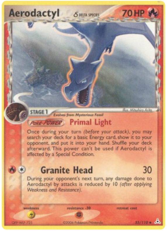
Card Details:
Set: EX Holon Phantoms
Card: 35/110
Rarity: Uncommon
Type: Fire
Illustrator: Mitsuhiro Arita
Printing: Normal, Reverse Holofoil
This is one of my favorite Aerodactyl artworks from the EX era.
Aerodactyl is flying high above the landscape, and the composition does a great job of making the Pokémon feel enormous.
The perspective is especially effective.
Rather than showing Aerodactyl from a conventional side view, the artwork makes it feel like you’re looking up at a prehistoric predator flying overhead.
It’s menacing without being overly complicated.
Why it’s underrated: The perspective and environment make Aerodactyl feel like a genuine prehistoric creature rather than simply another Pokémon flying through the air.
#1 – Beedrill
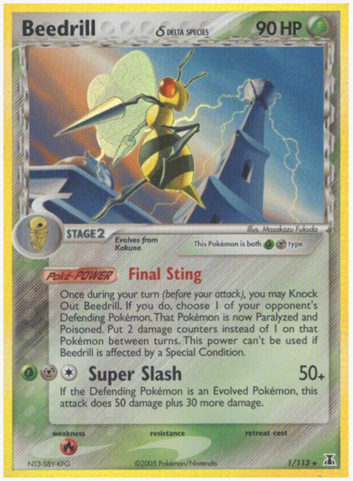
Card Details:
Set: EX Delta Species
Card: 1/113
Rarity: Rare Holo
Type: Grass/Metal
Illustrator: Masakazu Fukuda
Printing: Reverse Holofoil, Holofoil
This one takes the top spot for me.
Beedrill has received plenty of great artwork throughout the Pokémon TCG, but there’s something particularly vicious about its appearance on this card.
The pose and expression make Beedrill look aggressive, dangerous, and completely in control.
That’s exactly how I want Beedrill to look.
What makes this card stand out even more is that it doesn’t need an elaborate scene or an incredibly complicated composition. The Pokémon itself carries the artwork.
For a Pokémon that can sometimes get overlooked next to more popular Bug-types, this card is a reminder that Beedrill can produce some seriously cool artwork.
Why it’s underrated: It’s one of the most intimidating Beedrill artworks in the Pokémon TCG, and I think it deserves much more attention from collectors.
Final Thoughts
The Delta Species era produced some of the most creative Pokémon card artwork of the EX era.
What makes these cards especially interesting to collectors is that the artwork often reimagines familiar Pokémon in completely different environments and styles. A Pokémon that normally has a certain personality or appearance can suddenly feel entirely different.
And that’s one of the reasons I enjoy collecting Delta Species cards.
You don’t necessarily need to own the most expensive card in a set to have an interesting collection. Sometimes the most memorable cards are the ones that simply have artwork you love looking at.
These ten are some of my favorite underrated Delta Species artworks, but there are plenty more that could have made the list.
Which Delta Species Pokémon card artwork would you put in your top 10?